If you’re looking to add some color to your home but don’t know where to start, look no further than Kevin McCloud’s book, “Choosing Colors.” As a renowned design expert and presenter of the hit show “Grand Designs,” McCloud knows a thing or two about creating beautiful and functional spaces. In this book, he shares his extensive knowledge and experience, guiding readers through the process of selecting the perfect colors for their homes.
KeyTakeaways
- Kevin McCloud’s book, “Choosing Colors,” is a valuable resource for anyone looking to add color to their home.
- McCloud is an expert in design and has extensive experience creating beautiful and functional spaces.
- The book provides guidance on selecting the best colors for different rooms in your home.
- Readers will learn about color theory and how different colors can impact the mood and atmosphere of a space.
- Incorporating neutral colors, accent colors, and complementary colors can help create a cohesive and visually appealing color scheme.
Understanding the Impact of Colors on our Homes
Color is a powerful tool for transforming our homes into inviting and comforting spaces. Every color has a unique impact on our mood and emotions, influencing our perception of the environment around us. By understanding the psychology of colors, we can make informed decisions about which colors to use in our homes to create the desired atmosphere.
Warm colors such as red, orange, and yellow are known for their ability to create a cozy and welcoming atmosphere. These colors are ideal for social areas such as living rooms and dining areas, where they can stimulate conversation and a sense of warmth.
Cool colors such as blue, green, and purple have a calming effect and are ideal for bedrooms and bathrooms where relaxation is a top priority. These colors are known for their ability to reduce stress levels and create a soothing environment.
When selecting colors for our homes, it’s important to consider the impact they will have on our mood and emotions. To help readers better understand the significance of color in home decor, Kevin McCloud provides a comprehensive guide to the effects of different colors and how they can be used to create harmonious and inviting living spaces.
The Science behind Colors in Decorating
Research has shown that certain colors can have a significant impact on our mood, productivity, and overall well-being. For instance, blue has been found to lower blood pressure and heart rate, while green is associated with feelings of tranquility and calmness.
Color can also be used to create the illusion of space and depth. Lighter colors tend to make spaces feel larger and more open, while darker shades can be used to create a cozy and intimate atmosphere.
| Color | Impact on Mood | Recommended Rooms |
|---|---|---|
| Red | Stimulates appetite and conversation | Kitchen, dining room |
| Orange | Energizing and uplifting | Fitness room, playroom |
| Yellow | Creates optimism and happiness | Kitchen, bathroom, living room |
| Green | Calming and soothing | Bedroom, bathroom, living room |
| Blue | Reduces stress and promotes relaxation | Bedroom, bathroom |
| Purple | Encourages creativity and contemplation | Study, home office |
By carefully selecting colors that align with our personal preferences and lifestyle, we can create homes that promote comfort, relaxation, and well-being.
The Basics of Color Theory
Understanding color theory is essential for creating harmonious and visually appealing spaces in your home. In his book, “Choosing Colors,” Kevin McCloud provides a comprehensive guide to the basics of color theory, including the primary, secondary, and tertiary colors.
The primary colors are red, yellow, and blue, and they cannot be created by mixing other colors. Secondary colors result from combining two primary colors, including orange, green, and purple. Tertiary colors are created by mixing a primary color with a secondary color, such as red-orange or blue-green.
Color harmonies are important for creating a cohesive color palette within a space. McCloud explains how to use the color wheel to determine harmonious color combinations, including analogous colors, which are adjacent to each other on the color wheel, and complementary colors, which are located directly opposite each other.
Analogous color schemes create a sense of harmony and balance, while complementary color schemes produce high-contrast and dynamic effects. By understanding color theory basics, you can choose colors with intention and create a visually stimulating and harmonious atmosphere in your home.
Utilizing the Power of Neutrals
Neutrals are a timeless and versatile choice when it comes to home decor. They are also an excellent way to create a sense of calm and sophistication. By incorporating shades of whites, grays, and browns, you can easily create a cohesive color palette that works in any room of the house.
Kevin McCloud, the author of “Choosing Colors,” suggests using a combination of warm and cool neutrals to add depth and texture to your interiors. For example, pairing a warm beige with a cool gray can create a balanced and harmonious look.
In addition to their aesthetic appeal, neutral colors also have other benefits. They are easy to work with and can complement a variety of other colors, making them a great base for any design scheme. Neutrals can also make a space feel larger, brighter, and more open, especially when paired with natural light.
When using neutrals, texture and pattern are key. Without contrast, a neutral color scheme can feel flat or boring. McCloud recommends incorporating different textures, such as wood, metal, and fabrics, to add interest and tactile appeal to a room.
Tips for Using Neutral Colors in Home Decor
| Tips | Description |
|---|---|
| Combine Warm and Cool Neutrals | Use a mix of warm and cool tones to create an engaging and balanced look. |
| Play with Textures | Use different materials, such as wood, metal, or textiles, to add depth and interest to a neutral color scheme. |
| Add Contrast | Incorporate contrast through different shades, patterns, or textures to avoid a flat or monotonous look. |
| Consider Natural Light | Neutral colors can enhance natural light and make a room feel bright and airy. |
Exploring Vibrant Color Schemes
When it comes to adding a pop of color to a room, vibrant schemes can be the perfect solution. By exploring a range of bold hues and lively combinations, you can create a visually stimulating environment that energizes and excites.
Vibrant color schemes can be high energy and dramatic, making them best suited for spaces that are meant to be lively and active. Think playrooms, home offices, and entertainment areas.
A key to utilizing vibrant color schemes effectively is balancing contrasting tones. In the table below, you can find examples of contrasting colors that pair well together:
| Color | Contrasting Color |
|---|---|
| Red | Turquoise |
| Yellow | Deep purple |
| Orange | Green |
Remember, using vibrant colors in moderation can be key to creating a cohesive and aesthetically pleasing space. Incorporating pops of color through accent pieces such as pillows, artwork, and decor can be an effective way to introduce bold hues without overwhelming a room.
Creating Harmony with Analogous Colors

Color harmony is a crucial aspect of creating a visually appealing and cohesive home decor. Analogous color schemes enable you to harmoniously blend colors without making your space look too monotonous. Analogous colors are those located in close proximity to each other on the color wheel. The colors used in an analogous color scheme typically share a common undertone, making them easy to blend.
Analogous color schemes are ideal for creating a harmonious and peaceful environment, which makes them perfect for bedrooms, living rooms, and other spaces where relaxation is desired. These color schemes can also be used in different areas of the home to create a seamless flow between rooms.
Here are a few practical tips for using analogous colors in your home:
- Start by selecting a dominant color from your preferred palette. This will be the primary color of your space.
- Select two or three adjacent colors on the color wheel that complement the dominant color. These will be your secondary and tertiary colors.
- Create a color hierarchy by using the dominant color more prominently than the other colors in your room.
- Add depth and texture to your space by using different shades and hues of your chosen colors.
- Use neutral tones such as white, beige, or gray as a backdrop for your color scheme to create a sense of balance.
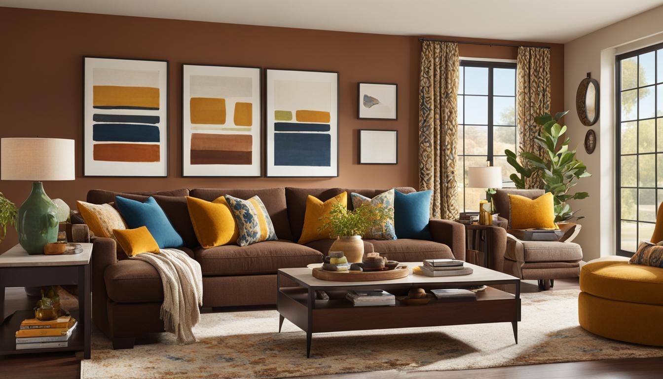
Using Complementary Colors for Impactful Contrast
In home decor, complementary colors are opposites on the color wheel that create bold and eye-catching contrasts. This pairing is commonly seen in nature, such as blue skies and orange sunsets. By using complementary colors in your design scheme, you can create high-impact focal points that draw the eye and add visual interest to your space. However, it’s crucial to use this color pairing in moderation, as too much can be overwhelming.
When considering complementary colors, keep in mind that the brightness and saturation of the colors you choose will affect the overall impact of the contrast. A high-contrast complementary pairing works best with a bright, vivid hue and its equally bright opposite, such as blue and orange. In contrast, a low-contrast pairing could be created using a muted version of each color, such as a pale blue-green shade with a soft peachy-orange.
It’s essential to strike a balance between complementary colors, and the texture or pattern used with them. Using too many patterns can make the space chaotic, while adding more texture can soften the effect. This approach works well with the rule of thirds in a room: one-third of complementary color, one-third of neutral, and one-third of another color, making it harmonious.
Examples:
| Complementary Colors | Usage |
|---|---|
| Red and Green | Christmas decor and accents |
| Purple and Yellow | Flower arrangements |
| Blue and Orange | Nautical and coastal decor |
When selecting complementary colors, consider where you’ll be using the combination in your home. For example, complementary colors would work well in a living room accent wall or colorful throw pillow, while a bedroom would benefit from a more subdued color scheme with subtle pops of contrasting colors.
By carefully selecting and using complementary colors, you can create stunning, high-impact designs that are sure to impress. Whether you opt for high or low contrast, make sure to balance the colors with texture or pattern for a cohesive and visually appealing look.
Incorporating Accent Colors
While neutral colors provide a timeless foundation and vibrant colors add excitement, incorporating accent colors is crucial to creating a cohesive and personalized space. According to Kevin McCloud, accent colors “can bring depth and richness to interiors and make them feel complete.”
When selecting accent colors, consider hues that complement the overall color scheme and add visual interest without overpowering the space. McCloud advises highlighting specific areas or elements with accent colors, such as a bright throw pillow on a neutral sofa or a colorful backsplash in the kitchen.
Remember, less is often more when it comes to accent colors. Use them strategically to enhance the overall design and bring personality to your home.
Understanding Lighting and its Effects on Colors
When it comes to designing your home’s color scheme, it’s essential to consider the impact of lighting. The right lighting can enhance the color and ambiance of your space, while poor lighting can leave your colors looking dull and lifeless.
Different lighting conditions can affect how colors appear, from natural daylight to warm indoor lighting or cool LED lighting. Natural daylight tends to highlight cooler hues and neutral colors while making warm colors appear duller. Indoor lighting has a similar effect, but the kind of bulb or fixture can also have an impact, as can the placement and direction of the light source.
When selecting colors for your home, it’s essential to test them in different lighting conditions to see how they look. Remember to think about the type of lighting used in the room and how it will interact with your chosen color scheme.
When considering lighting, it’s also important to ensure that your room has adequate lighting to bring out the best in your color choices. Dark or poorly lit rooms can wash out colors and make them look dull, while proper lighting can highlight all the beautiful elements of your color scheme.
Keep in mind that lighting can affect not only the color on your walls and furniture but also the colors of your textiles, accessories, and decor. Utilize different lighting fixtures to accentuate specific elements of your room and create a more dynamic visual effect.
Remember, your choice of lighting can enhance or detract from your color scheme, so it’s essential to consider both in tandem when designing your space. By paying attention to the different effects that lighting can have on your colors, you can create a beautiful and harmonious home that looks great in any light.
Practical Tips for Choosing Colors in Different Rooms
Choosing the right colors for each room in your home can be a daunting task, but with these practical tips from Kevin McCloud, you’ll be able to create a cohesive color scheme that enhances the functionality and aesthetics of each space.
Consider the Room’s Functionality
When selecting colors, it’s important to consider the room’s intended use. For example, calming colors like blues and greens are great for bedrooms, while bright colors like yellows and oranges can energize a kitchen or dining area.
Choose a Color Scheme
Once you’ve established the room’s function, select a color scheme that works well with the room’s purpose. For instance, a monochromatic color scheme can create a peaceful atmosphere, while complementary colors add drama and excitement.
Utilize Neutral Colors
McCloud recommends incorporating neutral colors like whites, grays, and beiges into any color scheme to create a balanced and sophisticated look. These colors are also versatile and work well with both bold and muted tones.
Consider the Room’s Natural Light
The amount of natural light in a room can greatly impact how colors will look. Consider the direction your windows face and how much sunlight each room receives throughout the day. Test paint samples on different walls to see how they appear in various lighting conditions.
Experiment with Accent Colors
Accent colors can add interest and personality to a room. Try incorporating pops of color through accessories like throw pillows, curtains, or artwork. McCloud advises choosing accent colors that complement the overall color scheme to avoid clashing.
Keep it Cohesive
Finally, it’s important to keep the color scheme cohesive throughout your home. Consider using a similar color palette or repeating accent colors in different rooms to create a sense of continuity.
Conclusion
Choosing the perfect colors for your home can be a daunting task, but with Kevin McCloud’s expert guide, “Choosing Colors,” you can approach the decision with confidence. By understanding the psychology of color, mastering color theory, and implementing practical tips for different rooms and lighting conditions, you can transform your home into a personalized sanctuary that reflects your unique style. Remember, color selection is not only about aesthetics, but also about creating a mood and atmosphere that enhances your daily life. We hope this article has provided you with valuable insights and inspiration for your next home decor project.